Last updated: February 25, 2025
Preface
YWAM Paris Connect (Youth with a Mission Paris Connect) is a Christian non-profit association based in France. The organization's central purposes are Christian trainings, humanitarian aid, and evangelism. While working as the Communications and Systems Lead, I was tasked with a branding overhaul and a website re-design.
My Approach
YWAM Paris Connect is (mostly) made of youth ages 18-30. It's target audience can broadly be described as young, international Christians with an interest in faith. As such, I began by creating a customer profile that would clearly identify a direction for the re-branding. I worked with a brand strategist to design branding guidelines for the association. It was then we needed to implement the changes in our digital spaces, specifically our socials and web design. I used Figma to create a wireframe of the website, then built it with no-code on Wix, since most of our organization had limited coding experience.
Vision and Innovation
The vision behind the website was to create a website that clearly communicated who we are as an association and our offerings. To give this effect, I decided to use large images, video, animations, and bold text. The navigation bar was made with the intention of breaking down information into four categories: Who we are, training, ministry, and getting involved. Lastly, the 'get started' button links to our Typeform portal.
Before the wireframing and building process began, I reviewed all our available analytics to see statistics such as the traffic source, click-through rate, bounce rate, and conversion rate. Then, I started user stories to better understand how and what users might navigate their search for information. These details together were important in the decision making process of designing a website that met the branding objectives and user experience.
Identifying Unique Challenges
A significant complexity was determining appropriate page responsiveness. Since we decided to use Wix based on skill familiarity, there are limitations to providing smooth responsiveness. I wanted the hero section to match viewport height, though to maintain page responsiveness, it wasn't exactly possible. I worked with Wix developers to find a solution that would fit our design needs, since it would never be as seamless as a fully custom code website.
Another difficulty was not only having to self-learn on how to use Wix, but also the inability to work on this large project simultaneously with another. At the time of writing, Wix doesn't allow users to edit a website at the same time making our workflow disjointed. If I made changes to the site or paused editing a certain page, it would be difficult to communicate with another team member where they should begin. In the end, I ended up designing and developing the entire website alone. Looking back, I would have done this process slightly differently to allow for team collaboration.
User-Centric Design
At its core, the website is built with the user in mind. The design appeals to its young primary target audience, while others such as investors or donors can visually grasp what the association is about. Large imagery matched with detailed information and links to important pages ensure that users can navigate the website effortlessly. The landing page displays a hero video with a clear call to action and it's corresponding button link. Below immediately and boldly shows the organizations mission statement, which clearly defines in writing the organization's objective. The remainder of the landing page is an overview of the offerings followed by a contact page. I chose not to include the association's main email anywhere on our website, but rather a contact form to centralize and track questions in our Hubspot CRM.
Meeting User Needs
The YWAM Paris Connect website ensures that users can quickly access the information they are searching for. Our Gen Z audience wants information quickly and they want it to look pretty. The home page serves as a gateway for the association's offering based on our user stories discovery. Using Google Analytics, I measure CTR and third party software for a heat map of the user's experience. With this information, I continue to make subtle tweaks to make the best possible experience, such as re-arranging button placement, changing language, etc. Fast rotating photos and animation is consistent throughout the site to maintain the target audience's need for style.
Detailed Pages and Features
Home: The gateway to the rest of the website. Contains surface level information with links to see more.
Our Story: A brief summary of the association's founders, early days, and vision going forward.
Impact Report: Animated graphics and designs surrounding the downloadable Impact Report.
FAQ: Detailed answers broken down in subheadings for a variety of questions.
DTS: Outlines the main 3-4 school offerings. This page discusses what schools look like and how they operate.
Focused Training: Similar to DTS, this page outlines the association's secondary school offerings.
Training Events: A cleaner layout intended for a slightly different audience: French locals. Other pages appeal more towards internationals. The training events page highlights events for locals to join.
School Pages: Each of the school pages follow the same layout, being youthful, photo-centric, and captivating through the use of story-telling. Essential information is available on each page, with several call to action buttons throughout the page.
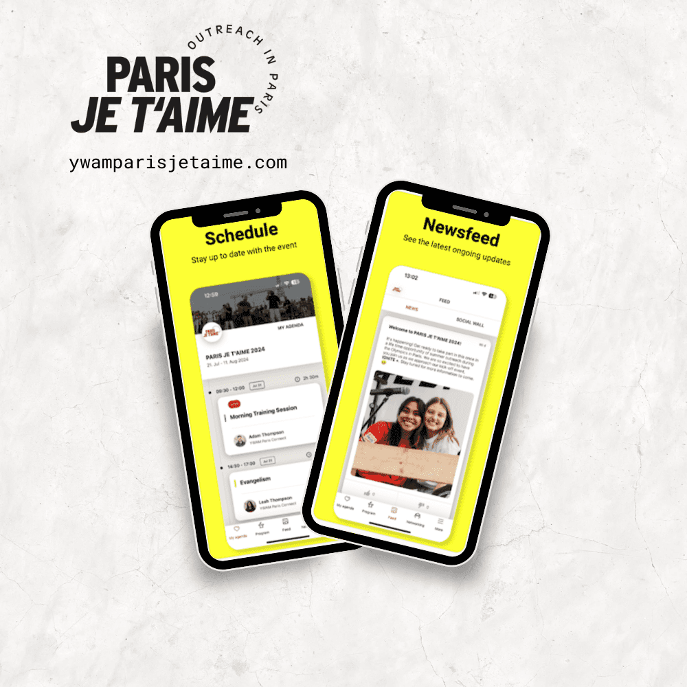
Paris Je t'Aime: Links to an external site, also hosted by YWAM Paris Connect and created by me.
IGNITE Nights: Highly visual page inviting locals to join for a monthly event. This page includes the event history and vision, inspirational videos, and information on how to join.
Connect Community: Similar to IGNITE Nights, this page is intended for locals interested in joining a weekly event. Clear information for taking part, matched with rotating photos of youth.
Ministry Calendar: This page displays public events held by the association through a Google Calendar integration.
Join Staff: A large call-to-action page sharing the vision and operational structure to encourage users to apply for positions. This page uses several buttons to encourage the user to apply.
Visit Us: Similar to the Join Staff page, there are several animations and graphics to share the culture of the association. Most notably, there is an embed integration with Checkfront, a hostel booking platform.
Seminars: This page invites users to host a seminar at YWAM Paris Connect. The design is centered around professionalism and clarity, speaking to a different target audience.
404: A fun error page, displaying a croissant and a pun.
Accessibility and Optimization
The YWAM Paris Connect website is designed with accessibility in mind, ensuring it can be easily navigated by all users, including those with disabilities. In addition to being accessible, the site is optimized for SEO, helping us reach a broader audience. By implementing SEO best practices, we improve search engine rankings, drive more traffic, and ensure that users can quickly find the resources and information they need. These optimizations not only help us stay competitive but also enable us to share our mission more effectively with people worldwide.
Conclusion
This product took considerable time to complete amidst a large learning curve. While I'm not strongly proficient in web design, building sites, or branding, I learned to develop my skills through the basis of learning-by-doing. From this project, I found greater appreciation and understanding on how I can work with designers and developers to build great products.
The website is live and has proven to be a success. The association has seen an increase in school applications, an increase in traffic, and positive feedback from several sources.